There is usually one wedding photograph you return to first. It might be the portrait where you both finally relax, a hand reaching across the dinner table, or the two of you looking very small beneath an enormous sky. It is not always the photograph you expected to love most.
Framing begins with that feeling. Before choosing a frame finish or deciding how many pictures will fit above the sofa, choose the moments you would like to live with. The best wedding display feels at home in the room and still takes you somewhere else when you look at it.
The customer projects in CustomMat’s photo collection suggest several lovely directions. There are small portraits surrounded by wide white mats, wedding photographs in slim black frames, warm wood galleries and a mat signed by the people who came to celebrate. Each gives the photographs a different mood. Here is how to find the approach that suits yours.
For a Classic Wedding: Black-and-White Portraits
Black-and-white wedding photographs draw attention to expressions, light and small gestures. In @kmerrilyhome’s display, three portraits sit above a wood cabinet in slim black frames. The light mats separate each photograph from its frame, while the repeated shapes make the group feel settled.
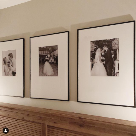
To bring this idea into your home, choose photographs that offer different distances: a close portrait, a fuller view of the couple and a moment with a little movement. The frames can match even when the photographs tell different parts of the day. A kiss and a shared laugh do not have to compete for attention.
Look at the actual prints together before choosing the mat. Some black-and-white photographs have a cool, silvery appearance; others have a warmer tone. Hold a few pale mat samples beside the paper and watch the faces. The right border should make the photograph feel comfortable, without making the highlights look unexpectedly grey or yellow.
For a Soft, Romantic Look: Small Photographs and Wide Mats
A photograph does not have to fill its frame to feel important. The pair from @alexa__sees__in__colour places small portraits inside generous white borders and light wood frames. The surrounding space invites you to come closer.
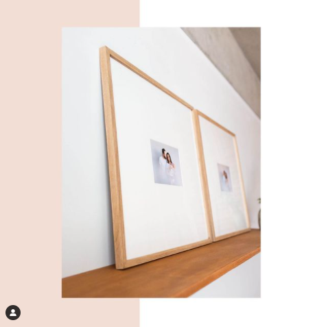
This is a beautiful direction for a quiet portrait, a hand-held bouquet, a detail of a veil or a candid moment before the ceremony. Choose an image that still reads clearly when printed small. A close embrace usually works better at that scale than a large group in which every face becomes difficult to see.
A pair can be especially personal: one photograph that each of you chooses, two moments from the same walk, or a portrait beside a meaningful detail. Give the frames a similar presence and let the photographs be slightly different. The result can feel collected and intimate, rather than like a matching set bought all at once.
Try this approach on a bedroom wall, beside a reading chair or above a small chest. If you are leaning frames on furniture, use a secure arrangement suited to your home and the frame maker’s guidance. A narrow shelf needs as much thought as a wall.
For a Garden, Woodland or Rustic Wedding: Bring in Natural Wood
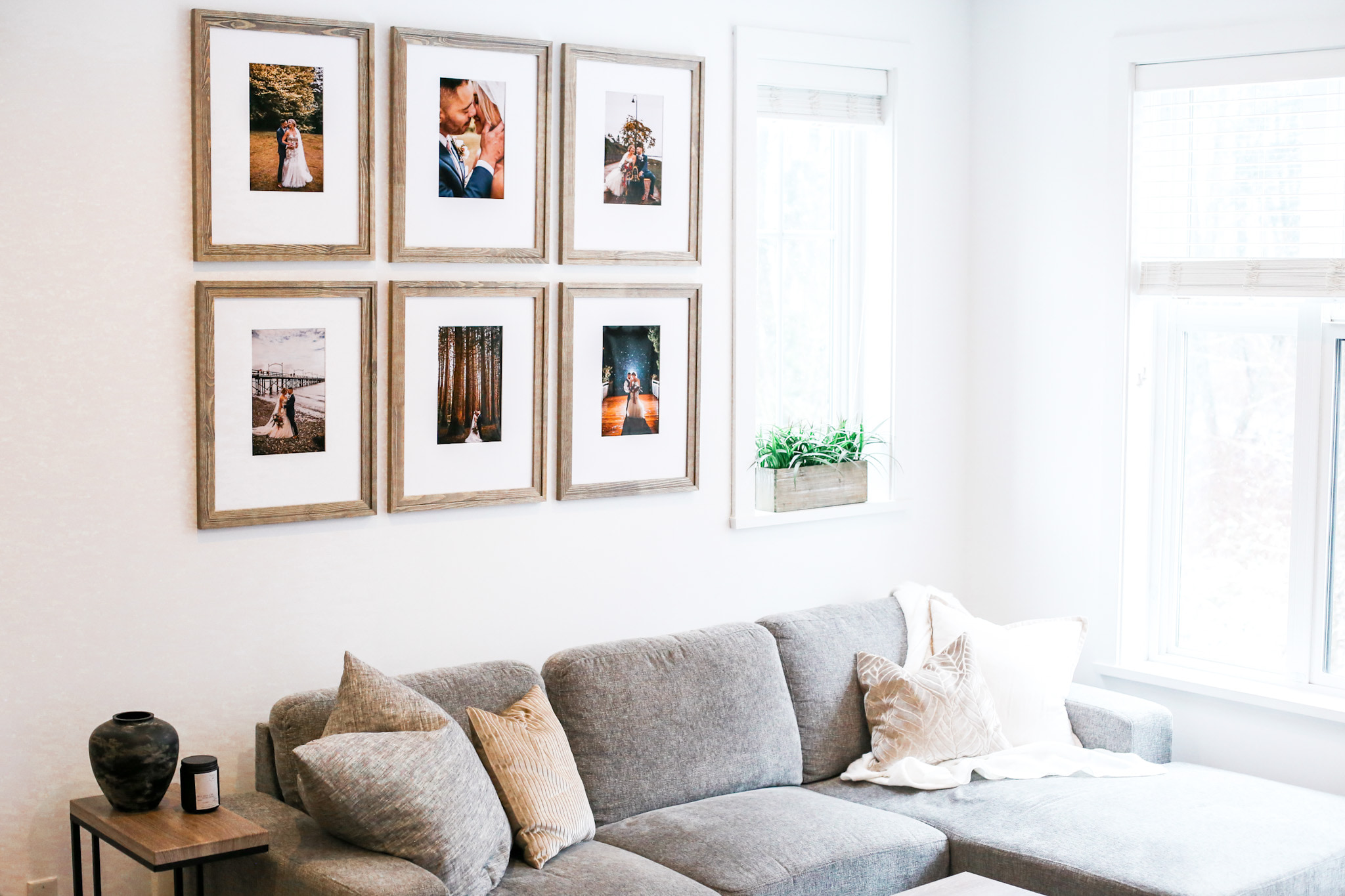
The six-frame wedding gallery at the top of this article is a lovely example of colour photographs working together. There are warm outdoor scenes, a close portrait, tall trees and a photograph taken after dark. The matching wood frames and pale mats give those different colours a common setting.
Wood is a useful place to start when your photographs contain foliage, stone, sand, timber or warm evening light. Its grain can echo the setting without copying the decorations from the wedding. A softly weathered finish creates a different effect from a smooth, dark frame, so compare the actual finish with the prints and the furniture around them.
Keep some contrast between the frame and the room. A pale frame on a pale wall can feel gentle; a deeper wood tone can give a colourful photograph a stronger boundary. Neither requires the whole room to become “wedding themed.” The display should belong in the home you share now.
If you are planning several frames, lay the photographs out together first. Spread the brightest colours and darkest scenes through the group. You are looking for a comfortable rhythm, not a rule that every picture needs the same lighting.
For a Destination Wedding: Frame the Place as Well as the People
Sometimes the setting is inseparable from the memory: a stretch of coast, the street outside the ceremony, a mountain path or the view from a hotel window. Those photographs deserve a place beside the portraits.
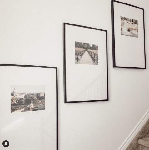
The staircase arrangement from @jess.findlay_ is a useful reference. Its photographs show places and landscapes, with wide mats and fine black frames connecting the group. The source images are not labelled as wedding photographs, but the framing idea translates beautifully to a wedding journey.
Try a portrait, a view of the place and one small detail that brings you back. It could be the doorway where you waited, a table set before guests arrived or the first morning of your honeymoon. Leaving people out of one photograph can give the neighbouring portraits more room to breathe.
Let the shape of each photograph guide the opening. A wide coastline may need a landscape opening, while a tall doorway may work better as a portrait. You can keep the frame finish and mat colour consistent without forcing every photograph into the same crop.
For the Story of the Day: Bring Several Moments into One Frame
A single photograph can hold the mood of a wedding. Several photographs can show how the day unfolded. A multi-opening mat is a good way to bring those moments together when you would prefer one finished piece on the wall.
Start with three images that have a reason to sit beside one another: getting ready, the ceremony and the celebration; a wide view, a portrait and a close detail; or three photographs of the same moment as it changes. Avoid choosing three nearly identical portraits simply because they have matching colours. Give each photograph something to contribute.
A family photograph can sit beside a couple portrait, too. The people who helped make the day matter do not have to stay in the album. Check every face against the planned opening, especially in group photographs where someone may stand close to the edge.
Arrange small paper versions on a table before deciding. If you find yourself reading the photographs in a different order, move them. Once the story feels right, use the multi-opening mat designer to explore a layout for your frame.
For a Wedding Keepsake Everyone Helps Create: The Signed Mat
A guest book is full of voices. A signed mat brings some of those voices onto the wall. In the customer example below, an outdoor couple photograph sits in a circular opening, with handwritten messages beginning to fill the white space around it.
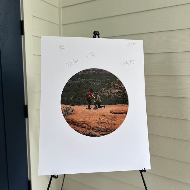
Plan the finished frame before the wedding, so you know which part of the mat will remain visible. Guests need a clear place to write, away from the photograph and the outer edge that the frame will cover. A simple instruction card and a spare sample for testing pens can help everyone feel comfortable adding a message.
Test your chosen pen on a matching piece of matboard, including how it looks once dry. Keep the mat supported on a stable surface while people sign, and give the writing time to dry before handling or framing it. If you want to replace an engagement photograph with a wedding portrait afterwards, choose the opening with that future photograph in mind.
The handwriting is part of the design. Leave room for a short message, a familiar nickname or the uneven signature of someone you love. This is one wedding piece that becomes more interesting as it fills up.
For the Years After the Wedding: Let the Gallery Grow
Your wedding photographs do not need a wall entirely to themselves. In @kendrafoundit’s pale-framed gallery, wedding and family photographs share a repeated arrangement. Small images, generous mats and consistent frames make photographs from different moments feel connected.
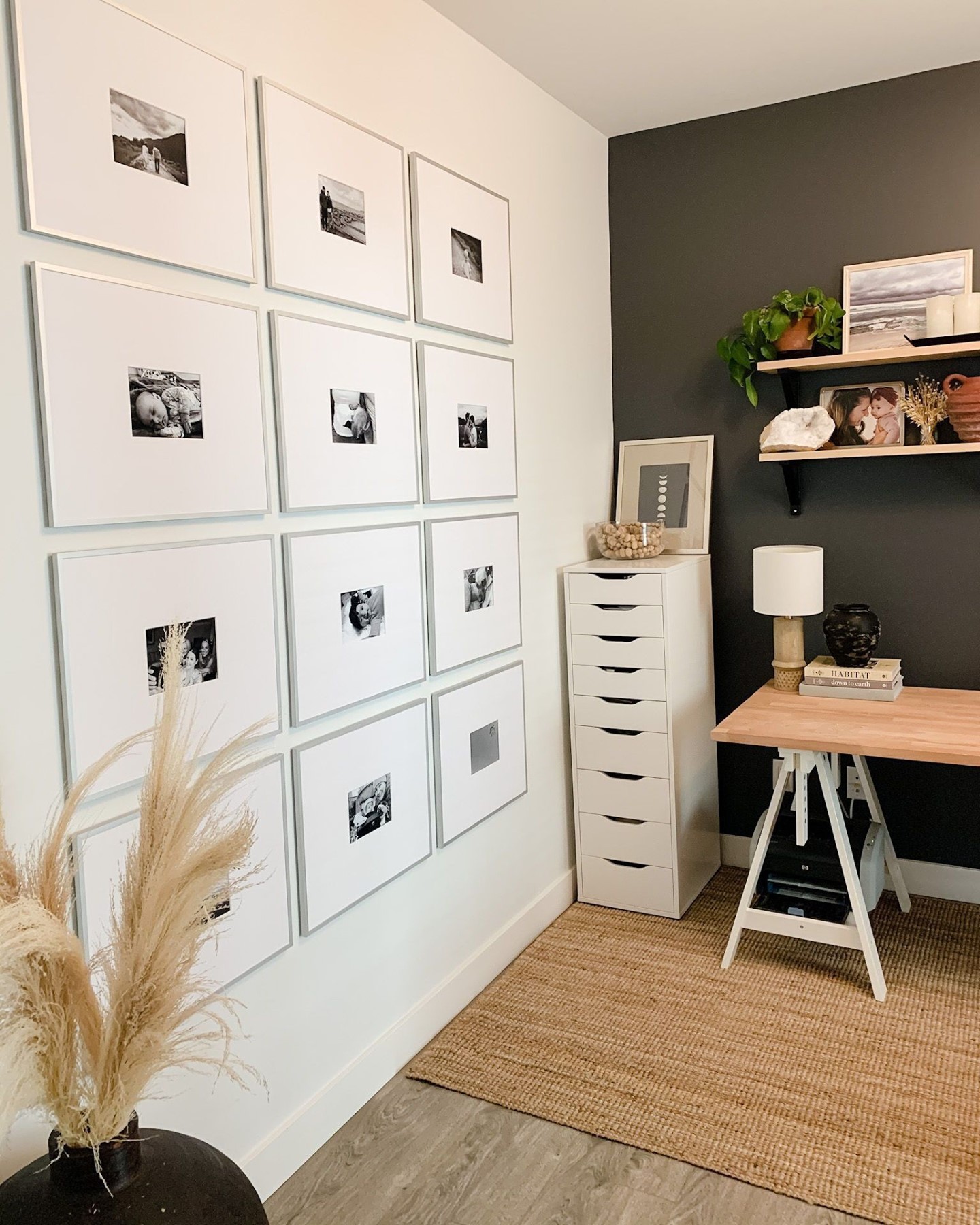
You might begin with the wedding, an early trip together and a photograph of your first home. Later, the wall can welcome an anniversary, a much-loved pet, a new family member or an ordinary afternoon you want to remember. There is no requirement to fill every space immediately.
Save a note of the frame style, mat colour and outer size if you hope to add to the arrangement. Keeping those choices consistent makes later additions easier to plan, even when the photographs themselves change. Use the same photograph treatment if you like a quiet wall, or allow a mix of colour and black-and-white for a more varied family story.
Choose the Mat Colour with the Print in Front of You
Wedding photographs often contain several different whites: clothing, flowers, paper and highlights in the scene. A mat that looks lovely on its own may feel quite different beside those details. Start with a physical print, then compare samples in the room where the frame will hang.
CustomMat’s pale options include #00 Cotton White, #01 Smooth White, #02 China White and #03 Bone. Compare them together in the colour guide, then use physical samples for the final choice. The photographed projects in this article do not establish which specific mat colours their creators used.
For a gentle look, try a sample that sits comfortably beside the print’s paper and lightest areas. For more definition, compare a cleaner-looking white with the frame around it. Look in daylight and under your usual evening lighting; a wedding photograph should feel good at the time you actually enjoy the room.
Turn the Idea into a Finished Frame
Step 1: Choose the frame
Choose a place for the finished piece and try a paper outline on the wall. Look at it from the doorway and from wherever you normally sit. Then choose a frame with the finish and overall presence you want. Check its stated fitting size and that it can accommodate the mat, print, glazing and backing.
If you already own the frame, measure its removable backing or existing mat. The decorative outside edge is not the size to order. Keep that frame-fit measurement separate from the size of your photograph.
Step 2: Order the matboard
Choose the mat’s outer size to fit the frame and its opening to suit the print. The opening usually covers a little of the paper edge, so check the visible crop carefully. Faces, a bouquet, a hand or a line of writing should stay comfortably inside the area you want to show.
A paper window is an easy way to preview the effect. Place it over the photograph and move it until the crop feels right. For several openings, test every photograph. The mat defines the view; the print still needs a suitable mounting method behind it.
Design your wedding photo mat →
Step 3: Order the photographs
Use the original image files or the high-resolution downloads supplied by your photographer. Check your print permission and request help if the file you have is only a small preview. A screenshot from a phone gallery or social post may look soft when enlarged.
For a matching group, order from the same lab in the same finish. Review the crop for each selected print size, and order a test print before committing to a large set. Once the prints arrive, confirm their actual paper size against your mat order before mounting them.
In Canada, Fujifilm Printlife is a starting point for ordering photo prints online. Check the available sizes, crop preview and delivery options for your order.
In the United States, Nations Photo Lab is a starting point for ordering photo prints online. Check the available sizes, crop preview and shipping options for your order.
A Place for the Photographs You Keep Coming Back To
You do not have to frame the entire wedding at once. Begin with one photograph you both love, or a small group that tells a story clearly. Choose a mat that suits the print and a frame that feels at home in the room.
Years later, the photograph that makes you pause may be a formal portrait, a blurred laugh or a message someone wrote in the corner of a mat. Giving it a place in your everyday life is what makes the framing worthwhile.